Types of Thermostat History Graphs
In order to learn how to interpret history graphs for advanced level of troubleshooting, let’s start with understanding the types of history graphs we are viewing.
Explore This Page
Space Temperature Graph
The Pelican Thermostat is measuring space temperature in real-time.
In the example below, at 5:50 pm the Cool Setting is 73°F and the Heat Setting is 69°F relative to the actual space temperature at 73°F. This graph indicates that the space is maintaining the Cool Setpoint within 0.05° degrees from the 73°F setpoint. We can also see this is during occupied hours and based on space demand the Economizer is opening the outside damper for ventilation.
On the History Graph, notice each line, bar, and filled area indicates what is going on in that space at a specific time.
- The dark blue horizontal line is your space temperature readings over time.
- The light blue horizontal line is your thermostat’s Cool setpoint.
- The red horizontal line is your thermostat’s Heat setpoint.
- The light blue vertical area indicates Cool Running.
- The red vertical area indicates Heat Running.
- The gray vertical bars indicates Fan Running.
- The light green horizontal area indicate Econ (Economizer) Running.
- The yellow vertical line indicates an Alarm Event (not shown in example).
- The black bars at the top of the graph indicate unoccupied times.
- The light gray horizontal bars at the bottom indicate Active Stages of heating or cooling (not shown in example).
To see more detailed information, press the (+) icon to zoom in the graph and move the graph’s time-stamp slider to see specific times on the graph.
Reference Graph
If you have a Pelican economizer, or a temperature and alarm sensor, with temperature probes connected to your thermostat, additional reference graphs will display.
In the example below, we are monitoring Supply Air Temperature, Return Air Temperature, and Outside Air Temperature. At exactly 1:07 PM the Supply Temperature was 57°F, the Return Temperature was 72°F, and the Outside Temperature was 85°F.
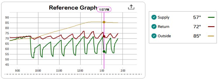
- The dark green horizontal line is the Supply Air Temperature
- The dark red horizontal line is Return Air Temperature.
- The dark yellow horizontal line is the Outside Air Temperature.
To see more detailed information, press the (+) icon to zoom in the graph and move the graph’s time-stamp slider to see specific times on the graph.
Position Graph
The Position Graph displays once there is data available from the damper, Pelican economizer, or actuator.
In the example below, indicates at 5:50 PM the Economizer damper position was 100% open.
- The green horizontal line is the Economizer position.
To see more detailed information, press the (+) icon to zoom in the graph and move the graph’s time-stamp slider to see specific times on the graph.
Depending on additional installed equipment, the Position Graph may also indicate actuator position or an additional damper position, etc.
Carbon Dioxide (CO2) Graph
If the thermostat has an integrated CO2 sensor, a CO2 Graph will display within that thermostat’s History Graphs.
In the example below, the CO2 level was 422 PPM at 5:50 PM. A CO2 level of 422 PPM indicates that the space can be interpreted as empty (no humans present) during this time, since 400 PPM (which is the assumed outdoor air concentration level) .
- The dark green horizontal line is your CO2 Level readings over time.
- The light green horizontal bar is your CO2 threshold.
When CO2 levels exceed the CO2 threshold, Outside Ventilation starts to open the damper above the set Minimum Ventilation Position, which can be viewed on the Position Graph.
To see more detailed information, press the (+) icon to zoom in the graph and move the graph’s time-stamp slider to see specific times on the graph.
Humidity Graph
If your thermostat has an integrated humidity sensor, a Humidity Graph will display within that thermostat’s History Graphs.
In the example below, the Humidity level was at 38% at 6:10 PM. Notice there is no active humidification or dehumidification cycle, this indicates that the space is satisfied at its current Humidity level because the current Humidity level at 38% is in-between the Humidify Setting (35%) and the Dehumidify Setting (55%).
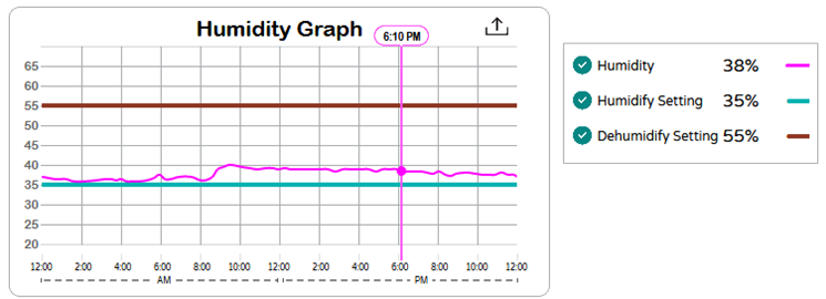
- The pink horizontal line is your space Humidity level over time.
- The teal green horizontal line is your Humidity setpoint.
- The dark red horizontal line is your Dehumidify setpoint.
To see more detailed information, press the (+) icon to zoom in the graph and move the graph’s time-stamp slider to see specific times on the graph.